My Usability Test Process with WRAL
Mobile Application
Overview
Usability tests are a fundamental part of any UX designer's tool kit. They're my favorite part of the job and always yield extraordinary insights for minimal cost. Usability tests can identify problems with onboarding new users, identify pain points for current users, and be used as a rubric to ensure new features and updates truly improve the user experience.
To help demonstrate how I build, execute and analyze a usability test I'll be using my work with WRAL and their News app.
WRAL Homepage
What is WRAL?
WRAL is a local news station and part of the NBC parent Network. They have a web presence but their primary focus is broadcasting in video. Their app is less a standalone build or a responsive-designed website and more closely resembles a scaled-down, mobile-specific web app.
What they wanted
The WRAL team was interested in knowing how their app measured against their main competitor's app and any recommendations we could make for improving the user experience on the app.
What I did
I led a team of four in a comparative/usability study of the WRAL and ABC11 news apps. I was the point of contact for the WRAL staff, performed background and user research, ran team meetings, and ensured deliverables were completed on time.
My USABILITY Test Process
Usability tests can run the gamut from well funded, highly regimented formal testing in a lab to "hey can I buy you coffee to try this app" guerrilla testing in a coffee shop. There is no wrong or right way to run the test itself as long as you are prepared and know what you are trying to get out of the test. To demonstrate the methods I have developed to conduct a usability test I will break it down into its stages:
Scoping meeting
Background research
Test creation
Pre-testing
Testing
Analysis
Presentation
Scoping meeting questions
Scoping Meetings
Much like in a design project, I always start off with a scoping meeting. I like to determine who is in the Core and All Hands groups, schedule major milestones, understand the budget, and ask goal refinement questions that mirror those used in a design project. However, due to the nature of usability tests usually being exploratory research, the measurements for success can be hard to nail down. It is during these meetings where I explain how I go about forming a hypothesis and identify measurements to test it.
For WRAL, as their stated goal was one of exploration (how does the user experience on their app compare to their competitors), we laid out how we were going to research their app, came up with a hypothesis, and planned to test our hypothesis to formulate answers to their stated goals.
Background Research
I try to spend as much time as I can and doing background research before I start formalizing a testing outline. During this time, I conduct open-ended exploratory interviews with key stakeholders to identify their target users and their users’ goals when using the product. After gaining this insight, I like to get as much hands-on experience with the product as I can. If I'm lucky enough to have never used the app before, I do an initial walkthrough where, without any help or guidance, I try to perform the key tasks the stakeholders identified. In doing so I keep track of quantifiable variables, such as number of clicks, and qualitative metrics, such as whether I ever felt like I didn’t know what to do next. For enterprise software, I also look at any training material the company provides.
WRAL identified the target audience as skewing older and being less tech-savvy on average. They also identified the user's primary goals of viewing the weather and being informed about the top news stories of the day. As this was a user-facing mobile application, most of the navigation and functionality was intuitive. However, there were several items I noted in my personal research that later informed my test creation.
Test Creation
Once I've collected enough information to give me a sense of both the goals and the product I start creating the usability test. The usability test usually consists of three to four activities that range in complexity that users will need to perform. The results from the users are measured against the most ideal path that the most advanced inexperienced user would take. The test also tends to include a post-task qualitative survey and an end-of-test open-ended interview.
For WRAL, we focused on three tasks: turning on a notification, finding a local news story, and looking for the weather. These tests would be performed on both the WRAL and ABC11 apps, reversing which app was used first for each user.
http://www.cbimakerspace.com/cbi/do-you-measure-twice-and-cut-once/
Pre-test
Before any test is put in front of users, especially tests where users such as doctors have to be paid high amounts for their time, I run several pretests with coworkers to identify any bugs, make last-minute improvements, and ensure I sound comfortable and natural when reading from the script.
For the WRAL pretest, we practiced running through the usability test with one another refining the language and rehearsing the script until we felt comfortable running through it in a natural and conversational way with users.
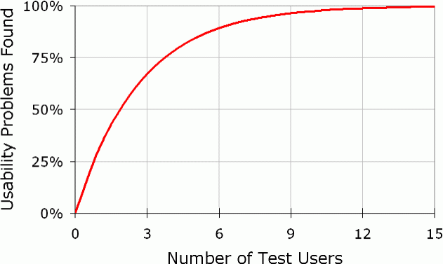
https://www.nngroup.com/articles/why-you-only-need-to-test-with-5-users/
Testing
In person or remote, with just 5 users you can identify many flaws in your project. Although the greatest insights can be pulled from the target users of the product, I have found having anyone run through a well defined usability test can yield highly actionable results.
For WRAL, we were only able to find younger, tech savvy users for our test, yet we still found numerous opportunities for improvement within the app.
Some direct quotes from users during testing
Analysis
After cleaning the data and creating visualizations as needed, I extract what insights I can and try to validate my hypothesis. I start by breaking things down by demographic, quantitative, and qualitative results. For usability tests, due to the small sample size, hard statistics tend to yield to high-level observational insights.
Some key insights we found for WRAL included being able to differentiate between notifications users received, suggesting a modification to the weather feature, and identifying a minor bug in the UI.
Presentation
Every audience needs a different kind of presentation. Developers and team leads tend to care more about the hard numbers, and would appreciate a table just as much as a visualization. Executives respond much better to a narrative.
For WRAL, we used a narrative PowerPoint presentation with a short video clip from one of the usability tests to drive the point home.
Results
Usability tests can lead to meaningful actionable results when implemented correctly. WRAL was very respective to our feedback and addressed many of the issues we presented. For this section I'll show how our suggestions were implemented and what I would have done if I was the designer incharge of implementing the feedback from the usablity tests.
Indication of Day Change
As the WRAL stakeholders indicated that weather lookup held the most value for their users and was the most preformed user task, we focused our testing on how it could be improved. We discovered a high failure rate on our weather finding task due to very weak visual clues to indicated day transitions in in the hourly forecast..
They addressed this by adding clear titles when a day changed. Their solution and visual patters is inline with what I would have suggested if I was the designer. They used a pattern that was consistent with section breaks in the rest of the app, and gave clear indication what day you were in. I feel confident this made a measurable improvement in the user experience.
Search Functionality
Compared to most websites, News sites have a substantial subset of users that just come to browse and are content with scrolling through the pages. However the user that do frequent a news website to find a specific news story or topic as seen by the usability tests, are easily frustrated if they can not quickly find what they are looking for.
The WRAL team did integrate our solution, but put it into the side menu. I believe the users would have been better served if it had been placed in the front header. Although hamburger menus have become commonplace for mobile applications, there is still a fair amount of users who still can’t “discover” them. This would be especially true for the older, less tech-savvy persona laid out by the WRAL team. The presence of a search icon on the main page could help cover some of the UX disruption caused by the reliance on a hamburger menu for the mobile application.
Notifications
Notifications are invaluable tool for any application but especially for news apps who can engage users when their product, news about current events, is most valuable to the users. However an over-reliance on notifications, especially irrelevant ones, can cause users to abandon an application entirely. We discovered in our testing that users that used notifications were dissatisfied with the type and frequency of notifications they were receiving from the WRAL news app.
The WRAL team did take are suggestions by added two more specific notifications that uses could turn on and off. While certainly an improvement in its own right, if I was the designer, I would point them to their primary competitor, the ABC 11 news app, which has a highly customizable notification system. Although implemented after we ran our usability tests, I would speculate it has a higher user satisfaction score than the WRAL notification system.


