OnBoarding REview with Durham's Parking Meters
Standalone Application

Overview
One of my specialties as a User Experience (UX) designer is creating a smooth, intuitive, and effective onboarding experience. Often overlooked, the onboarding experience is typically the decision point between a user becoming a recurring power user or a frustrated, single-use detractor. To demonstrate my process, I’ll be walking through the onboarding experience for first-time users of the City of Durham’s paid parking kiosk.
Executive Overview
At one point, paying for parking was fast, simple, and intuitive. As the utility for parking revenue has grown for cities, so has the onboarding process for first time users. At several points during the process, the user’s goal of paying for parking in Downtown Durham is impeded by unnecessary steps and confusing instructions. A streamlined process that removes these roadblocks and moves to “just in time,” simplified instructions will improve the user experience without the need for a whole product redesign.
Why you should care
Onboarding is your users’ first experience with your product. It includes everything from when they first interact with your product to when they successfully complete the task they came to accomplish. How easy, intuitive, and enjoyable their experience is will define their future expectations of your product and colors how they talk about it with others. Do it well and you will have a new customer who is more likely to be a powerful advocate for your product. Do it poorly and not only you have a frustrated user who may never complete their task, but they also will only have a negative experience to share with others.
Durham’s parking process
After an extensive evaluation, the Durham City Council modernized its downtown paid parking system to digital kiosks that track parking by users’ license plate numbers. These digital kiosks meet the business goals of the city and give users the ability to pay with credit cards. Despite this, the new system has faced constant backlash from residents and visitors alike. Most of this can be traced to a poorly executed onboarding experience. There are small alterations that could make big improvements in the user experience for parking in Durham.
The Onboarding User experience
The easiest way to talk about the onboarding experience for Durham’s parking is to walk through the existing experience for a user and break it down to see where there is room for improvement. Let’s start with a “real” user story to help contextualize the onboarding process.
As Dana exits her car, she is running late to her reservation at M Sushi, and the DPAC show she’s seeing afterwards starts in an hour. She found some good street parking and wants to pay for enough parking to make it through the dinner and the show.
Let’s walk through each of the current steps using our story from below.
The walk-up
Dana quickly identifies the pay station and walks up to it.
My reflections
Using a tall grey box that is synonymous with most modern parking pay stations and the national standardized parking iconography of a “P” ensures the user does not have to spend very much mental energy deciphering what is the pay station and where it is.
My suggestions
Keep the kiosk as-is, or perhaps put the Durham city logo on the side of the box to reinforce the idea that the user is in the right place to pay for parking..

Activating the screen
The screen is off by default, so Dana looks around for some indication of what to do with no help in sight. As her frustration mounts, she looks down at the complex keyboard below. She hits the green button, and to her relief, the screen turns on.
My reflections
When the screen is turned off by default, the user is left to find information elsewhere. The two indicators that are in place to help the user are hidden: The first is a message at the top of the machine that blends into the background and is not placed where users would look first. The second is a small, de-emphasized button on a discordant keyboard that does not stand out enough to help get the user’s attention.
My suggestions
If money was no option, a keyboard redesign would, by far, be the best solution. Making the start button stand out and ensuring that it’s the first button a user sees would eliminate any current pain points of activating the screen.
However, if brought in today, my suggestions would be to (1) move the “PRESS THE (Start) BUTTON BELOW TO BEGIN” to where the “Use Exact Amount, No Change Given” sticker is, (2) change the font to CamelCase (no need to shout instructions to people), (3) invert the colors, and (4) change the wording to say, “Press Any Key To Begin.” I would also recommend adding a sticker next to that new p90text with a picture of a license plate saying that you will need to know your plate number. I would also move the “Use Exact Amount, No Change Given” notification down to where people would be putting in money (since that’s when people will need to know that information) and would get rid of the “follow the on-screen instructions” sticker since it adds an extra step for users to read and interpret before doing what they were already going to do. (Users need to follow the on-screen instructions in order to complete the process.)
The welcome screen
After activating the screen, Dana is greeted by a static image that contains Durham’s branding, a welcome message, and instructions to push a button. Frustrated, Dana begins repeatedly hitting the green button, which successfully moves her to the next screen.
My reflections
In isolation, this is a very user-friendly screen. It has a clear indication of what to do with a simple, distinct message of, “press any key to continue.” However, since we have already established that the user is in the right place, this screen seems redundant and requires additional user action to move forward.
My suggestions
I would put a timer on this screen that moves to the next screen automatically after a second. This would allow for branding without requiring the user to exert extra mental energy to find the button again.

License plate entry
Dana reads the instructions and realizes that she needs to go get her license plate number. She abandons the process, goes back to her car, takes a picture of her license plate, and comes back to the machine. After completing the first two steps again, she's back at the license plate entry screen, now worried that she's going to be late for her reservation. She then enters her license plate number and hits the green print key.
My reflections
It is a critical flaw in the user experience whenever a user must abandon a process and restart. This is unfortunate because many elements on the screen are incredibly well-designed. On the left side of the screen, there are instructions for what the user needs to do and an input field in which to do it in. This allows experienced users to move quickly through this step without being encumbered by unnecessary assistants. For those new onboarding users who do need additional help, an animated graphic representing the use of the keypad below gives them an indication of where to find the solution to the input field enigma. The clock at the top of the screen is not yet relevant, but it is not distracting. The bottom stays consistent with the previous screens, indicating how to complete the task.
My suggestions
There should be a clear indication that a user will need their license plate number before they get to this screen (at least until this form of parking payment becomes more ubiquitous).
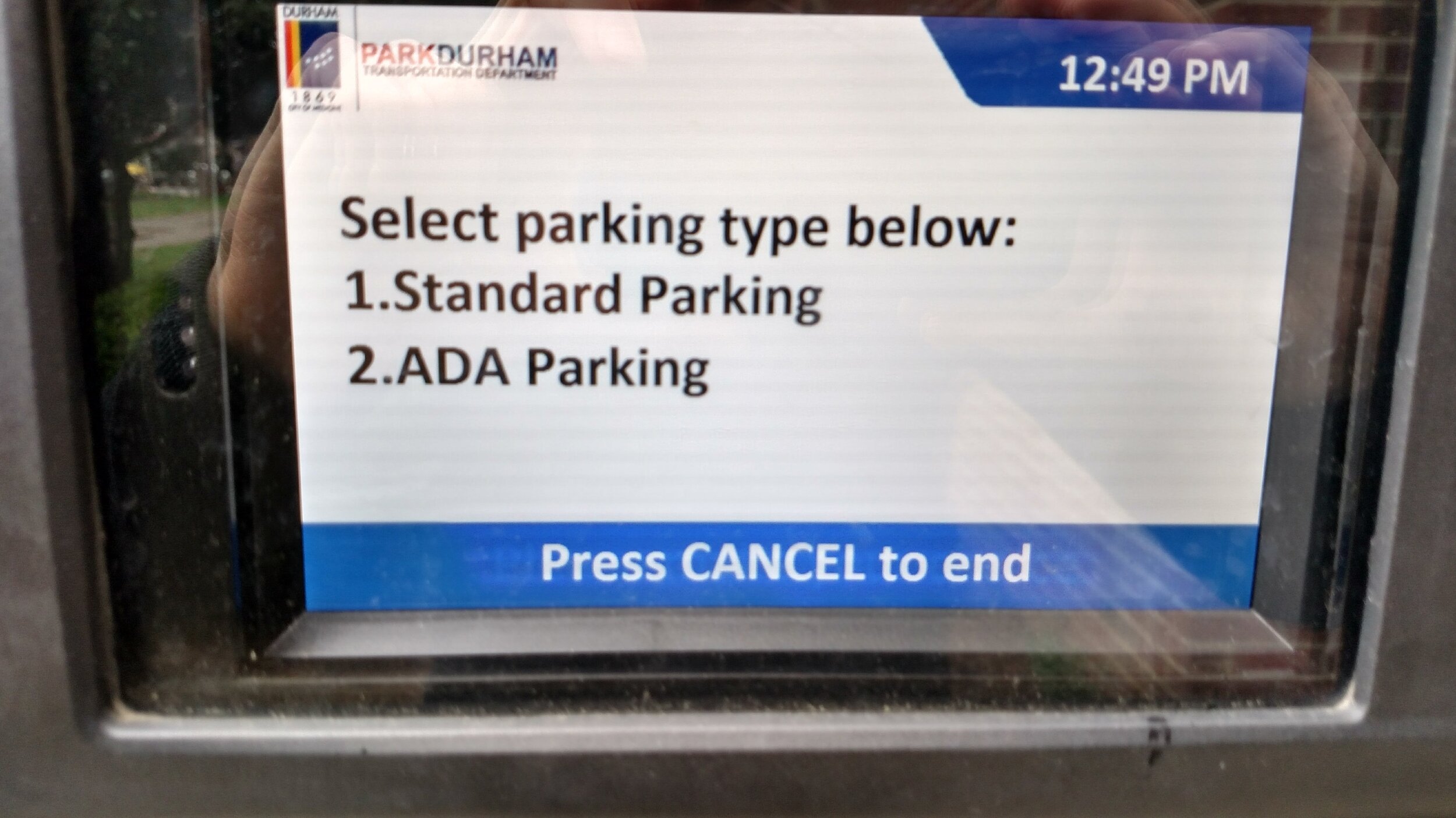
Discount screen
After entering her license plate information, Dana is presented with a screen that has options for a special rate change. She chooses the standard parking rate, as none of the special discounts apply to her.
My reflections
There are less intrusive ways that can be integrated later in the process that would allow users to apply discounts and would make this screen unnecessary.
My suggestions
Make “Apply special discounts” a button on the payment screen. This will allow people looking for the discounts to find and apply them while allowing others to move forward without disruption.
Payment screen
Dana is happy to see that she can pay by credit card. However, she sees conflicting messages about whether she can use her American Express card, so she decides to use her MasterCard instead.
My reflections
The clock in the corner shows people what time it is in reflection to how much time they want to pay for without having to look at their own devices. They can clearly see how much it will cost per hour and all the payment methods they can use. There is also the just-in-time notification that no change will be given. However, there is contradictory messaging around what type of credit cards can be used: the sticky note on the outside of the screen indicates only Visa and MasterCard, while the on-screen notification indicates otherwise.
My suggestions
First, ensure there is consistency across all notifications. Second, separate out the two types of payment—coins/bills and credit cards—and associate the related information with each of them. Last, include the amount of time you are adding and put that beside the time when the meter will run out.
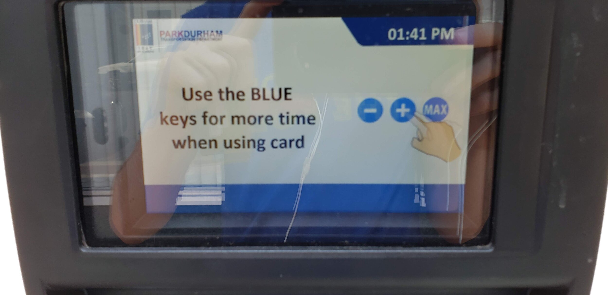
Time adjustment screen
After Dana has inserted a credit card, she is moved to a time adjustment screen where she hits the “Max” button, and the system quickly processes her payment.
My reflections
This is an extremely well-done screen with one glaring flaw. On the positive side, the clock is in the same place and still gives the necessary information that needs to be there. The screen is void of all other information that isn't directly relevant to the task at hand. The addition of the “Max” button helps a subset of users. It is also a good user experience that the time starting point is in the exact middle of the screen, making it equally convenient for people that want to add less or more time. The one sticking point is that there is no way to see how much time you put in; you can only see what time the parking expires.
My suggestions
Add a way for the user to see the amount of time they put in and place it next to the time when the parking will run out.
"Transaction finished" screen
After the process has been completed, Dana is greeted with the screen that only says, “Transaction finished.” She is given a receipt, but is unsure if, like other places, she needs to put it on her dashboard or not. She decides to do it anyway just to be safe and rushes off to the restaurant.
My reflections
There's no indication to the user about what to do next. One of the benefits of this system is that by using license plate numbers, users don’t need to do anything else once they’ve finished paying. There is also a lack of humanity in the phrase, “Transaction finished.”
My suggestions
Reconstruct this screen to cover what the user accomplished in a human way. Something like, "Your car with the license plate number [their license plate number] has successfully paid to park until [time]. Please enjoy your time in Durham.”
conclusion
As can be seen, small choices during development can have a huge effect on the way users experience your product. In order to make the best onboarding experience possible, I look through the eyes of a first time user and try to find any way I can make their experience a little bit better.